Exploring the power of colour in Halloween, Christmas marketing and beyond
Halloween lights up in vibrant oranges and deep purples, and Christmas looms with its traditional reds and greens. Have you ever wondered why these colours are so closely associated with holidays? Is it just tradition, or does something deeper influence our response? At Visual Identity, we understand that colour is more than just an aesthetic choice. It is an influential tool in marketing, psychology, and emotional response. This Halloween, let’s delve into how and why colours have become a language of their own. In addition, whether breaking these norms can make or break a campaign.
“Colors, like features, follow the changes of the emotions.”
– Pablo Picasso
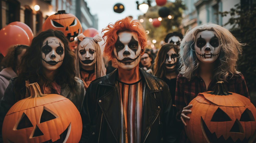
The origins of holiday colour in marketing: How orange, purple, red, and green became iconic
Halloween – Halloween’s colour palette of orange and purple harks back to centuries-old traditions. The vibrant orange reflects autumn harvests, while purple, an unconventional spooky twist, adds a mysterious, mystical touch. Historians suggest that orange represents life and the autumn harvest. While purple gives a supernatural edge that speaks to Halloween‘s eerie folklore and supernatural undertones.
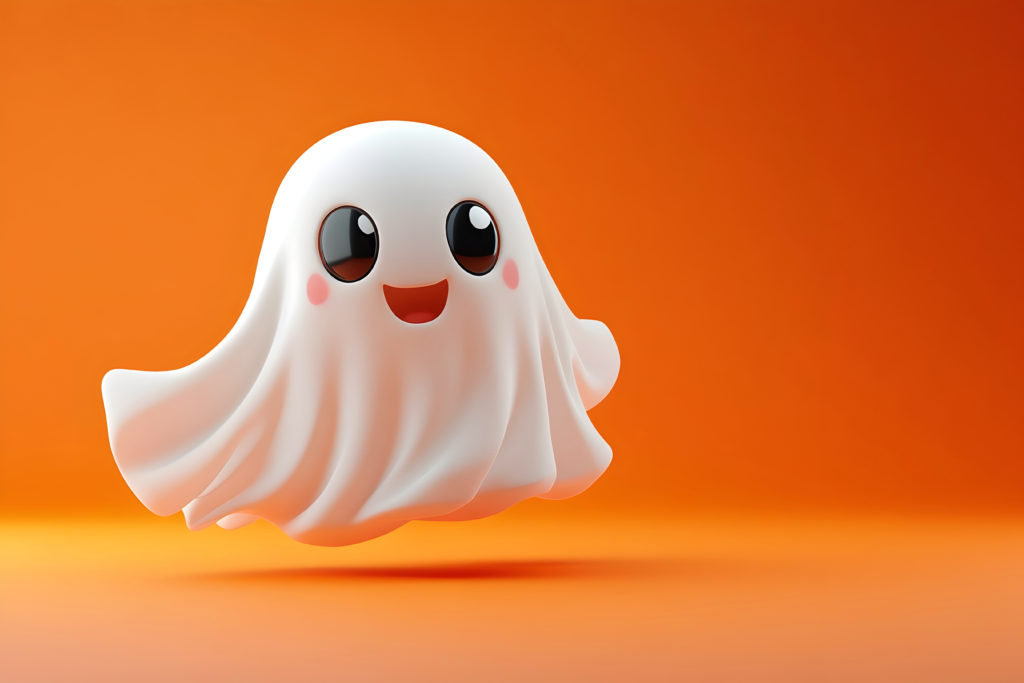
Christmas – Christmas’s colours have roots in both Christianity and winter folklore. Red and green not only evoke festive joy but also draw on traditional symbols. Green is tied to evergreen trees, symbols of life and resilience. Plus red represents the apple in the Garden of Eden or, more popularly, the attire of jolly Father Christmas. Marketing theorists have noted these associations are so ingrained that the colours themselves can evoke holiday spirit almost instantly.
Why these colours work in marketing – Colours don’t just represent annual holidays. They evoke the specific emotions we associate with each event. Orange and purple excite anticipation and mystery around Halloween, while red and green evoke warmth and cheer around Christmas. Our brains respond on a subconscious level to these combinations. They create a mental shortcut to “high energy” the instant we see them. This association is so strong that using these colours can enhance brand awareness and make holiday campaigns feel timely and relevant.
The psychology of pink and blue: From Valentine’s day to corporate identity
Pink – Traditionally associated with Valentine’s Day, pink is often seen as the colour of romance, gentleness, and warmth. Brands use pink to evoke feelings of love, femininity and affection, especially during Valentine’s promotions. This makes it ideal for products and services related to relationships or self-care. This colour also appeals broadly to younger audiences. It creates a soft, approachable aesthetic that signals care and kindness, ideal for brands in beauty, fashion, and even wellness industries.
Blue – Often associated with business. Blue conveys trust, reliability, and calm, making it a popular choice for corporate and tech brands. Research indicates that blue can reduce anxiety and build a sense of security. This is why it’s commonly used by banks, technology firms, and professional services. For brands, incorporating blue in campaigns adds a professional touch. This gives the impression of stability and dependability, which can strengthen customer loyalty and confidence.
Green and yellow: Nature, growth, and joy of colour marketing
Green – While green is heavily associated with Christmas, it has become the universal colour for nature, sustainability, and growth. Brands use green to symbolise environmental consciousness, health, and balance, making it popular among eco-friendly and wellness brands. Green is known to have a calming effect on the mind. It is frequently used in campaigns where tranquillity, stability, or environmental friendliness are emphasised – such as health products, natural foods, or travel.
Yellow – Yellow symbolises joy, optimism, and energy. With its ability to grab attention, yellow is often used in retail or clearance sales to convey urgency or excitement. In campaigns, yellow can inject a cheerful, sunny quality into the brand’s message. Doing this creates an upbeat tone that’s particularly appealing to younger audiences. Used sparingly, yellow is highly effective for grabbing attention. However, in excess, it can be overwhelming, so it’s often used to highlight rather than dominate.
Black and white: Sophistication, simplicity, and timeless appeal
Black – Black represents sophistication, authority, and elegance. High-end brands use black to convey luxury and exclusivity, as it evokes a sense of formality and timelessness. In Halloween campaigns, black can lend a spooky, eerie quality, amplifying the mysterious vibe of the holiday. However, brands across all sectors use black to add sophistication to their visuals and create a sense of power and mystery.

White – White symbolises simplicity, purity, and cleanliness, making it a popular choice in minimalist and wellness-oriented branding. White space, or the use of open, uncluttered areas, creates a sense of clarity and simplicity, allowing key messages to stand out. Brands in healthcare, tech, and beauty often use white to create a refreshing, pure aesthetic, while more playful brands may use white as a clean background to allow other colours to pop.
The science behind colour marketing: How psychology influences consumer reaction
Research in colour psychology reveals that colours influence moods, behaviours, and purchasing decisions – ƒwhether we’re aware of it or not. Studies have shown that 90% of snap judgments about products can be based on colour alone. (Source: Satyendra Singh, University of Winnipeg). Psychologically, orange often represents excitement, warmth, and pumpkins (perfect for Halloween!), while purple can signify mystery or even luxury. Meanwhile, red triggers feelings of urgency, caution and passion, while green is calming, symbolising nature, health, and prosperity.
These deep-rooted associations might stem from evolutionary psychology. Warm colours like red can signal ripeness or alertness (helpful when food gathering). While green is likely associated with safety in natural environments. Understanding these psychological responses can give marketers a powerful tool. It allows us to design campaigns that resonate with specific emotions and expectations.
Tradition vs. innovation: Should we stick to expected colours or take a bold step?
At Visual Identity, we understand that tradition in branding has power – but sometimes, challenging tradition can be even more impactful. Sticking to conventional colours often builds on long-established emotional connections, instantly engaging audiences. But brands that break from tradition – using icy blues for Christmas or monochrome palettes for Halloween, for example – can capture attention and stand out from competitors.
The risk? Going too far outside these norms can confuse or even alienate your audience. This Halloween, experimenting with colour might mean using black and white for a sophisticated twist on Halloween marketing. But always consider your brand’s values and the audience’s expectations – sometimes blending tradition with a subtle twist can be the sweet spot for maximising impact without sacrificing recognition.
“Colour is a power which directly influences the soul.”
– Wassily Kandinsky
How to use colour marketing effectively in your next campaign
- Match colour to emotion – Before selecting colours, consider what emotional response you want to evoke. Warmer colours (like reds, oranges, and yellows) create excitement, while cooler shades (like blues and greens) convey calm.
- Balance tradition with innovation – If tradition works for your audience, lean into it. But if your brand thrives on standing out, consider a fresh approach. Perhaps adding gold accents for Halloween or pastel blues for Christmas could make your campaign more memorable.
- Consider your brand identity – Always align colours with your brand’s core identity. At Visual Identity, we carefully analyse how colours resonate with our audience’s emotional expectations and find creative ways to innovate.
- Leverage holiday themes subtly – Use traditional colours as accents or secondary colours rather than dominating the palette. This approach can make your campaign feel relevant without feeling cliched.


Colour theory and the future of holiday campaigns
While holiday colours are rooted in tradition and psychology. Our evolving understanding of colour in marketing allows us to explore new, daring options. Brands today have the opportunity to redefine what these colours mean for their audiences, challenging expectations and creating new traditions.
A final thought from Visual Identity
At Visual Identity, we don’t just follow trends; we question them. We believe that colours are powerful tools that, when used thoughtfully, can transform a campaign. Sometimes, sticking to the expectations can strengthen a brand, and sometimes, challenging it can elevate it. This Halloween, as we revel in the oranges and purples. But we remember that every colour choice tells a story, and we strive to tell the most impactful ones for our clients.
Don’t be spooked
Ready to summon a campaign that’ll haunt your audience in the best way? Contact us today to unlock our wickedly effective marketing and campaign services. From spellbinding strategy to frightfully good execution, we’re here to elevate your brand’s online presence and keep your audience under your spell.
Contact us today – Let’s make your campaign boo-tiful!

#ColourPsychology #HalloweenMarketing #VisualIdentity #HolidayCampaigns #MarketingTips #Branding