The new Machins Solicitors website is here and it’s already making a huge impact – offering an innovative, informative user experience.
These long-established local solicitors have boosted their online presence with a complete rebrand and visual overhaul.

Machins Solicitors LLP has operated under the name of “Machins” since 1920 and can trace its roots back to a law firm that had opened for business in the late 1800’s. Having just celebrated their 100 year anniversary, they felt it was an appropriate time to modernised and refresh their image with a re-brand and align this with a new website project and launch.
The firm recognised that to support the growth of the business there was a need to emotionally connect with existing customers and establish stronger relationships with new audiences. In this competitive market, it is important to stand out from the crowd and be perceived as a highly experienced legal team, knowledgeable in achieving the best possible outcomes, and a firm with a long-established heritage that continues to modernise and build on its solid foundations.
A brand new look and feel
The Machins brand presence had weakened over the years, design trends and use of palette, had weakened the brand’s strength. Importantly, the business strategy had changed due to the inclusion of new services and focus on broader target audiences. To refocus the digital strategy and launch new services areas, it became clear there was a strong requirement to differentiate the firm in a crowded market place, to strengthen its awareness to gain competitive advantage.
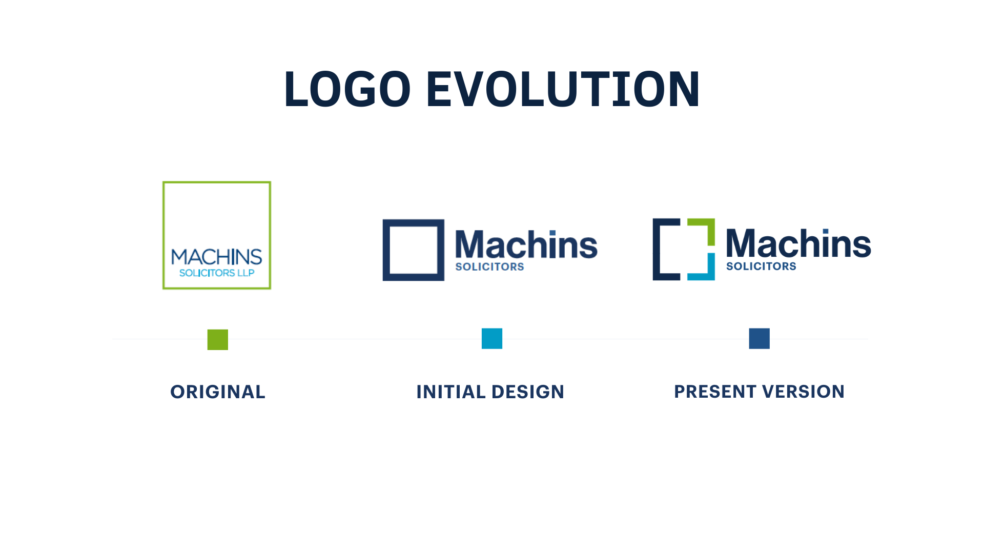
Often, website build projects mean that the companies existing logo doesn’t work as well as it could on screen and on a responsive websites. In this case, the outer square contained the typography therefore limiting the size and legibility of the firms name, this didn’t work well in terms of brand recognition or usability in the navigation bar at the top of the new website.
It was time to think outside the box!
The word Machins was released from its containment. Now living outside the box the imbalance could be addressed. The square, which was previously over sized could be decreased in size and the Machins typography strengthened to improve recognition of the name.
Later developments of the new brand were designed specifically included to address the firm’s two main audiences – individuals and businesses.
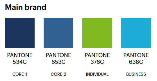
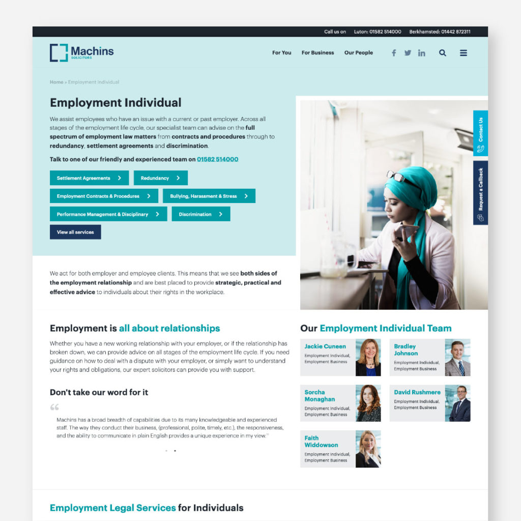
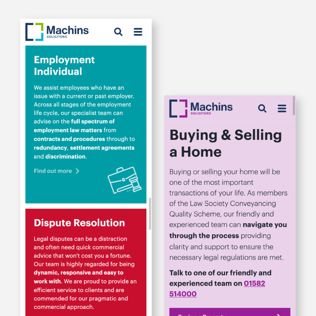
New sub brand colours have been assigned to each of their key areas of expertise, to make it easier to navigate throughout the site and identify the services you’re looking for.

Imagery was an important consideration throughout the website design. VI sourced new high quality, emotive images to represent each of Machins services. The image bank created follow a distinct theme, in order to portray the same look and feel throughout the website, as well as their social media channels.
A new online presence
We’ve taken Machins from a restrictive CMS onto a completely bespoke website, which gives them the ability to control every aspect of their online presence.
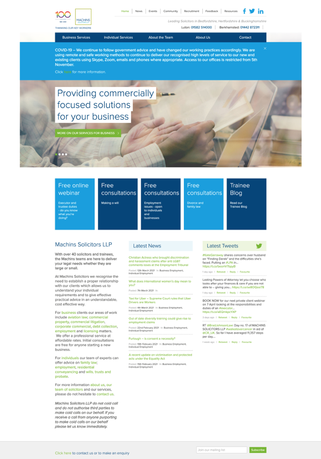
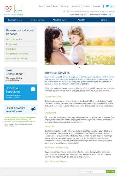
The previous desktop website had become outdated and was more of a online ‘brochure’ than a conversion tool. With a reduced mobile version website and 5 service specific campaign landing pages.
The new website is the perfect mix of functionality, beauty and engaging experience – and works perfectly on every device and screen.

Think immersive user journey with a ton of bespoke functionality and custom elements!
Marketing Collateral
In-line with the new brand-look, VI designed new stationary items for Machins, aligned with the brand guidelines created for each of their business services.
Existing collateral, such as, letter heads, leaflets and business cards were revitalised to incorporate new brand elements – giving the firm a consistent brand identity across of their communications.
Like what you see? If you’re looking for a similar refresh, get in touch to arrange a discussion today. We’d love to be a part of your next project.
We’re very proud of this project! Check out the website here: https://www.machins.co.uk/


